Accordion Block: Content 1 (wysiwyg)
Kitchen Sink Page
Showing All Blocks available to the Page Builder

Content & Image Block: Content (wysiwyg)
Options:
- Image position (Right / Left)
- Image style (Normal / Content Height / Small)
- Widgets (relationship to Widgets channel)


Content & Video Block: with Interactive Video
Options:
- Interactive Player (supports YouTube or Vimeo)
- Video Background (Vimeo only - only enter Vimeo video ID, not full URL)
- Video position (Right / Left)
Content Columns Block: Content 1 (wysiwyg)
Options:
- Logo (letterbox image; example of letterbox image usage)
- Button URL/Text (adds button link)
- Centered? (toggle)
- Shadow Border? (toggle)
- Widgets (relationship to Widgets channel)

Content Columns Block: Content 2 (wysiwyg)
This column has a logo, button, is centered and has shadow border
Content Columns Block: Content 3 (wysiwyg)
This column has a widget.
 CTA Grid Block: Heading 1
Example text here...
 CTA Grid Block: Heading 2
Example text here... This row with an internal link
 CTA Grid Block: Heading 3
Example text here... This row with an external link and custom Button Text
 CTA Grid (SM) Block: Heading 1
Example text here...
 CTA Grid (SM) Block: Heading 2
Example text here...
 CTA Grid (SM) Block: Heading 3
Example text here... This row with an internal link
 CTA Grid (SM) Block: Heading 4
Example text here... This row with an external link and custom Button Text
Form Block: Form Heading
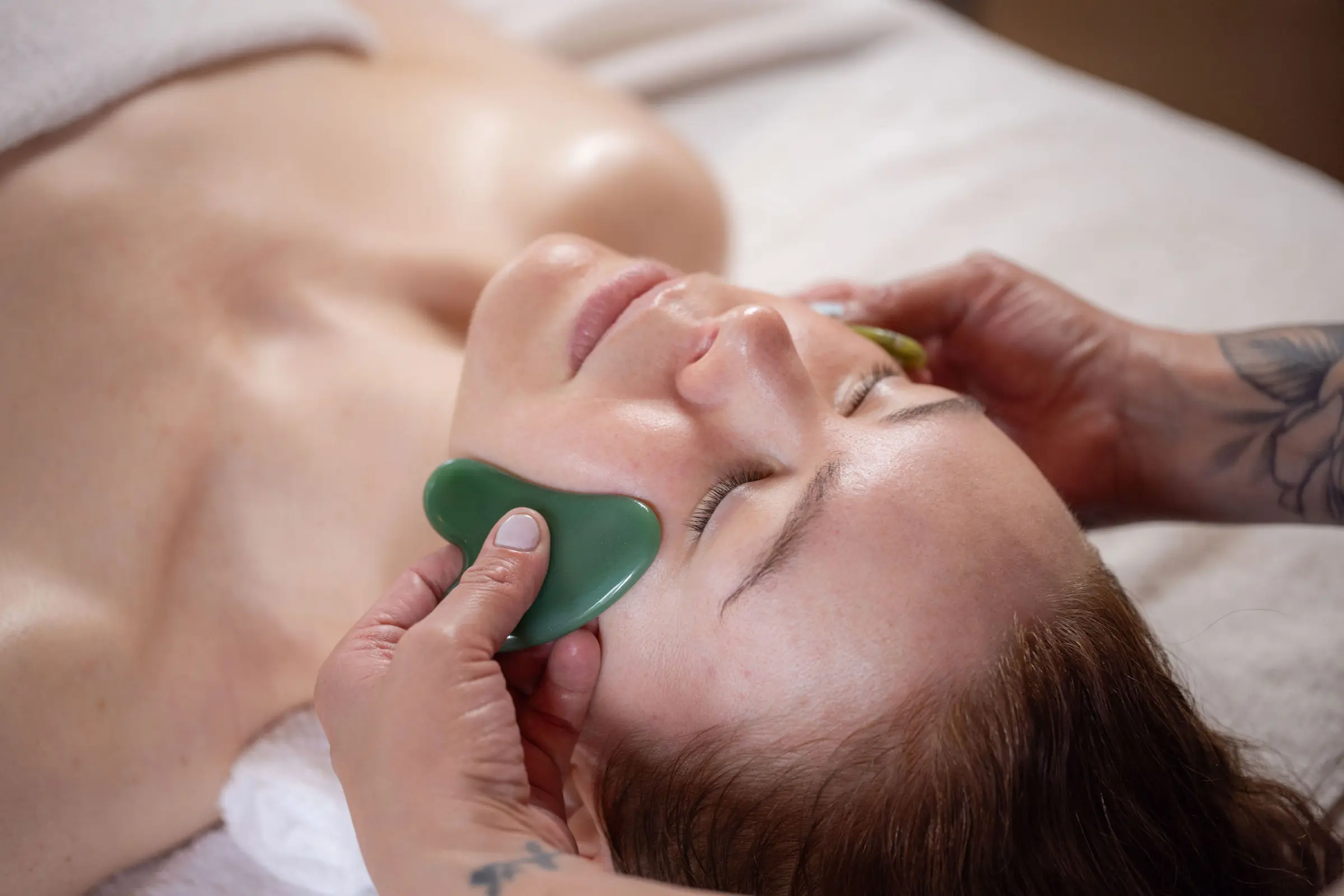
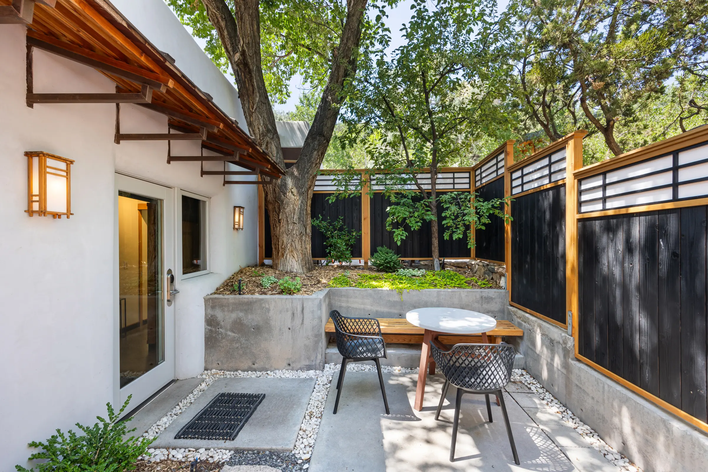
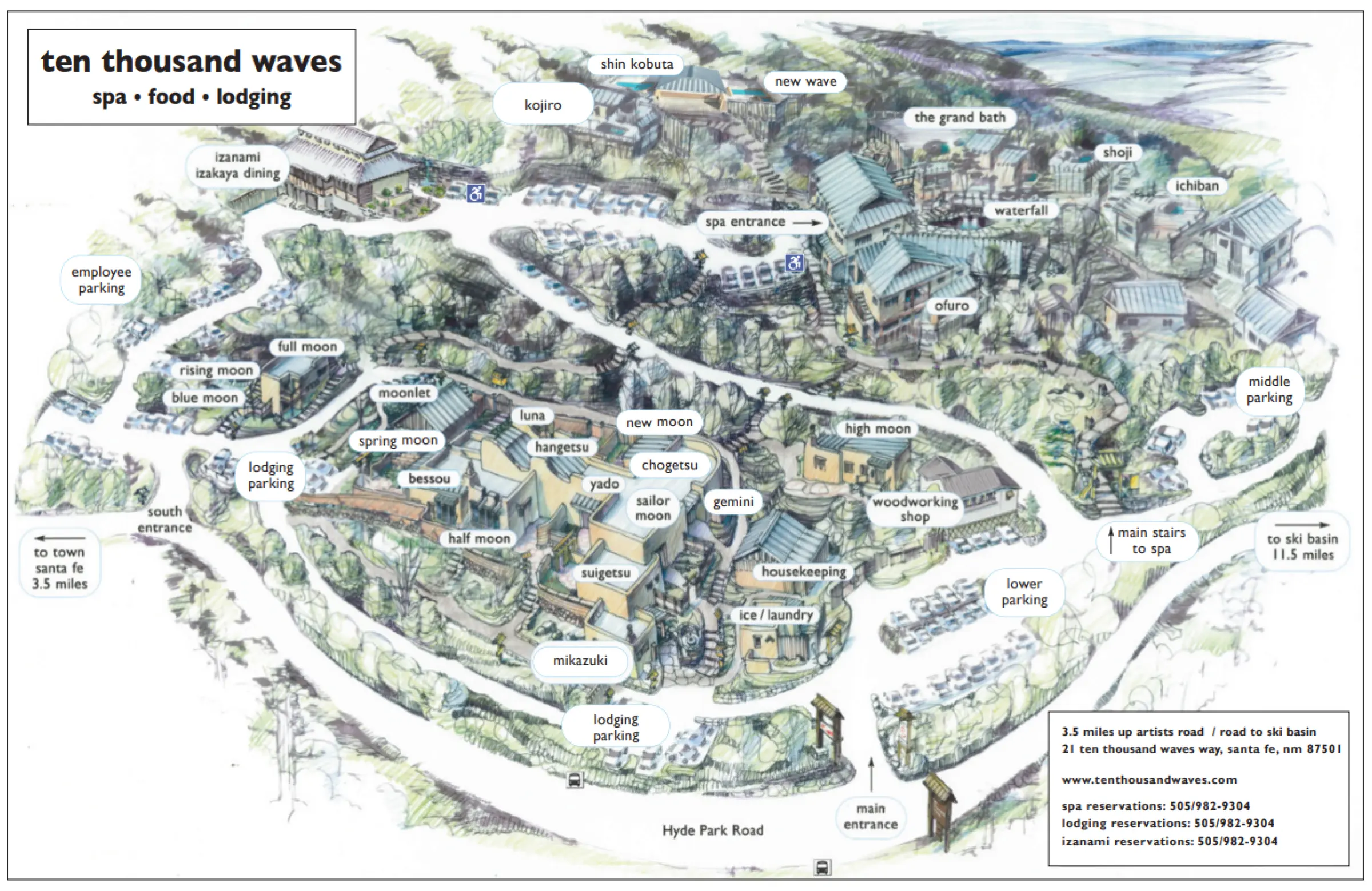
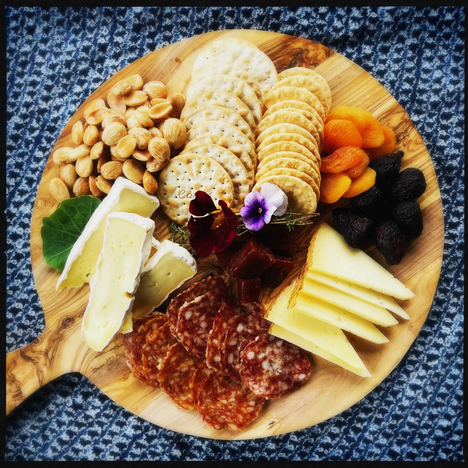


Popup Content Block - seen below when editing this page. Link to Popup Content by using a # followed by the exact “unique identifier” supplied in the Popup Content Block, then apply the “Popup Link” style from the ‘Styles’ dropdown. For the below example the link you would enter into the link URL would be #example-popup
Example supplied below, which can be a regular link or a button:
Example usage: /info/join-our-team & /plan-your-visit (as of 7/7/2026 anyway)
To link to a Section Heading anchor, follow the same steps, but do not apply the “Popup Link” style from the ‘Styles’ dropdown, eg this next link links to #example-section but without the “Popup Link” style:
Popup Content Block
Popup Content Block: Content here…
Section Heading Block: Heading
Single Content Block: Content (wysiwyg)
Options:
- Content Width (Constrained Wide / Constrained Narrow)
- Center Content? (toggle)
- Shadow Border? (toggle)
- Widgets (relationship to Widgets channel)


Sliding Banners Block: Overlay Content 1

Sliding Banners Block: Overlay Content 2
Testimonials Block: Heading
Options for the Testimonials Block above are:
- Choose Specific Testimonials (relationships)
- Choose a category of Testimonials (dropdown - categories can be changed/added)
- Leave both of those blank to pull from all Testimonials
- Show (number - how many you want to show)
- Randomize? (toggle - shows latest if not turned on)
Example usage above is showing the latest 5 Testimonials in the ‘Spa’ category (only 3 exist so only showing those 3).
Another example usage: to show 3 random Testimonials from all categories, leave both ‘Specific Testimonials’ and ‘Category’ selections blank, set ‘Show’ to 3 and turn ‘Randomize’ on.
Content & Gallery Block: Content (wysiwyg)
Options:
- Embed Content (used for embedding Menu Link Buttons, but could be added to)
- Widgets (relationship to Widgets channel)
- Image & Video Gallery (multiple rows, each must include image but video is optional)